Content
▶
NTL
▶
Core
▶
Classes
▽
Controls
▶
AlphaBar
▶
Bevel
▶
BitBtn
▶
Button
▶
CheckBox
▶
ColorBox
▶
CoolBar
▶
DrawGrid
▶
DropDown
▶
Edit
▶
EditCalc
▶
FileList
▶
Frame
▶
GroupBox
▶
HotKey
▶
HSVBar
▶
HSVPlane
▶
Image
▶
Label
▶
ListBox
▶
MainMenu
▶
MaskEdit
▶
Memo
▶
PageControl
▶
PaintBox
▶
Panel
▶
Select
▶
Shape
▶
Splitter
▶
TabSheet
▶
Toggle
▶
ToolBar
▶
TrackBar
▶
TreeView
▶
UpDown
▶
UpDownEx
▶
Forms
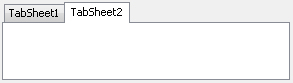
PageControl
PageControl control looks by default like on the picture below. It may have several tabs which are used to group controls(you may put different sets of controls on different tabs) and switch between them. Only one tab can be visible at the same time. Tab header also can be placed at any side of the control. Each tab of the PageControl is helper control TabSheet. When you place controls onto a tab, you actually place them onto a corresponding TabSheet.