Tutorial: font explorer
In this tutorial we will describe how fonts work in the framework. You will see and understand the meaning of all its properties. Additionally you will learn how to work with several standard widgets, use helper renderer functions and draw directly on the form working with renderer being used by the form.
Introduction
In this tutorial we will create an application which allows to edit font properties and see how text drawn with that font looks immediately after property change. It will be something like font property explorer. We won't explain how to create project and form in this tutorial as it was explained many times in other tutorials. If you don't recall it you may read, for example, Tutorial: "Todo list" application to see how a project and a form can be created using Nitisa for Visual Studio extension, and Tutorial: "Todo list" application (standalone) to see how a project and a form can be created in standalone mode.
main.cpp file is also trivial and standard. You may copy it from one of the previous tutorials if you use framework in standalone mode or leave it unchanged if you create project using extension.
It is an obvious choice to use some widget to display text and change that widget font properties to achieve our goal. The best candidate for this is Label widget. But we are going to do it another way. We are going to draw text directly on the form. Before drawing directly on a form it is useful to know how drawing is going in the Nitisa.
When a form detects that something needs to be drawn, it does following.
-
Drawing step #1 (first pass).
- Calls its own notification NotifyOnPaint.
- Calls its own event OnPaint.
-
For each visible widget, sorted by widget's z-order and then by creation order, does:
- Calls widget's notification NotifyOnPaint.
- Calls widget's event OnPaint.
- Do the same #1.3 for widget's child widgets.
- Calls widget's notification NotifyOnPaintEnd.
- Calls widget's event OnPaintEnd.
- Calls its own notification NotifyOnPaintEnd.
- Calls its own event OnPaintEnd.
-
Drawing step #2 (last pass).
- Calls its own notification NotifyOnPaint.
- Calls its own event OnPaint.
-
For each visible widget, sorted by widget's z-order and then by creation order, does:
- Calls widget's notification NotifyOnPaint.
- Calls widget's event OnPaint.
- Do the same #2.3 for widget's child widgets.
- Calls widget's notification NotifyOnPaintEnd.
- Calls widget's event OnPaintEnd.
- Calls its own notification NotifyOnPaintEnd.
- Calls its own event OnPaintEnd.
So the drawing actually happens 2 times. Step #1 is being used for regular drawing and step #2 is being used for special drawing when some widget require to draw itself or its part over all other widgets on the form. For example, when dropdown widget is opened, its list of options should be over everything on the form and so it draws the list in the second pass. We don't need to draw text over everything, so we are going to draw in the first step only. When drawing notification or event is called it has an argument of type struct MessagePaint. That structure has a member bool LastPass indicating whether a notification/event is called in step #1 (false) or in step #2 (true). That is how we can ignore second drawing step.
Notifications are strongly not recommended to be rewritten. They are supposed to be used by widget/form/... developers only. In the applications events should be used. As we do not need the text to be drawn over any widget we should not use OnPaintEnd event. So in our case we need to use form's OnPaint event to draw the text.
Form layout
Lets now create a form which will look like the one on the image below.
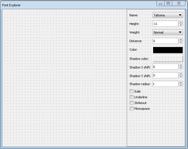
To create such a form do the following.
- Create a project called FontExplorer.
- Create a form (if it is not created automatically).
- Change form's Name property to FormMain.
- Change form's Caption property to Font Explorer.
- Change form's State property to Maximized.
- Add widget GroupBox to the form.
- Change widget's Caption property to Properties.
- Change widget's UseMask property to false. Mask is needed to clip child widgets if they are outside of parent widget area. In most cases this is not true and mask can be disabled to optimize performance.
- Change widget's Align property to Right.
- Change widget's UseParentFont property to false.
- Add widget Label to the group box.
- Change widget's Caption property to Name:.
- Add widget DropDown to the group box.
- Change widget's Name property to DropDownName.
- Change widget's Editable property to false.
- Add new item to the widget by clicking on circle with + sign inside in the Hierarchy Editor.
- Change item's Caption property to Tahoma.
- Add new item to the widget by clicking on circle with + sign inside in the Hierarchy Editor.
- Change item's Caption property to Times New Roman.
- Add new item to the widget by clicking on circle with + sign inside in the Hierarchy Editor.
- Change item's Caption property to Courier New.
- Click on dropdown widget in Hierarchy Editor to see its properties and change widget's ActiveIndex property to 0.
- Generate name for widget's event called OnSelect.
- Add widget Label to the group box.
- Change widget's Caption property to Height:.
- Add widget Edit to the group box.
- Change widget's Name property to EditHeight.
- Add widget UpDown to the group box.
- Change widget's Name property to UpDownHeight.
- Change widget's Min property to -100.
- Change widget's Value property to -11.
- Change widget's AssignedTo property to EditHeight.
- Generate name for widget's event called OnChange.
- Add widget Label to the group box.
- Change widget's Caption property to Weight:.
- Add widget DropDown to the group box.
- Change widget's Name property to DropDownWeight.
- Change widget's Editable property to false.
- Add new item to the widget by clicking on circle with + sign inside in the Hierarchy Editor.
- Change item's Caption property to Thin.
- Add new item to the widget by clicking on circle with + sign inside in the Hierarchy Editor.
- Change item's Caption property to Extra light.
- Add new item to the widget by clicking on circle with + sign inside in the Hierarchy Editor.
- Change item's Caption property to Light.
- Add new item to the widget by clicking on circle with + sign inside in the Hierarchy Editor.
- Change item's Caption property to Normal.
- Add new item to the widget by clicking on circle with + sign inside in the Hierarchy Editor.
- Change item's Caption property to Medium.
- Add new item to the widget by clicking on circle with + sign inside in the Hierarchy Editor.
- Change item's Caption property to Semi bold.
- Add new item to the widget by clicking on circle with + sign inside in the Hierarchy Editor.
- Change item's Caption property to Bold.
- Add new item to the widget by clicking on circle with + sign inside in the Hierarchy Editor.
- Change item's Caption property to Extra bold.
- Add new item to the widget by clicking on circle with + sign inside in the Hierarchy Editor.
- Change item's Caption property to Heavy.
- Click on dropdown widget in Hierarchy Editor to see its properties and change widget's ActiveIndex property to 3.
- Generate name for widget's event called OnSelect.
- Add widget Label to the group box.
- Change widget's Caption property to Distance:.
- Add widget Edit to the group box.
- Change widget's Name property to EditDistance.
- Add widget UpDown to the group box.
- Change widget's Name property to UpDownDistance.
- Change widget's Min property to -100.
- Change widget's AssignedTo property to EditDistance.
- Generate name for widget's event called OnChange.
- Add widget Label to the group box.
- Change widget's Caption property to Color:.
- Add widget Panel to the group box.
- Change widget's Name property to PanelColor.
- Change widget's Caption property to empty value.
- Change widget's Cursor property to Hand.
- Change widget's BackgroundColor property to { 0, 0, 0, 255 } (black).
- Generate name for widget's event called OnLeftMouseButtonUp.
- Add widget Label to the group box.
- Change widget's Caption property to Shadow color:.
- Add widget Panel to the group box.
- Change widget's Name property to PanelShadowColor.
- Change widget's Caption property to empty value.
- Change widget's Cursor property to Hand.
- Change widget's BackgroundColor property to { 0, 0, 0, 0 } (black).
- Generate name for widget's event called OnLeftMouseButtonUp.
- Add widget Label to the group box.
- Change widget's Caption property to Shadow X shift:.
- Add widget Edit to the group box.
- Change widget's Name property to EditShadowShiftX.
- Add widget UpDown to the group box.
- Change widget's Name property to UpDownShadowShiftX.
- Change widget's Min property to -100.
- Change widget's AssignedTo property to EditShadowShiftX.
- Generate name for widget's event called OnChange.
- Add widget Label to the group box.
- Change widget's Caption property to Shadow Y shift:.
- Add widget Edit to the group box.
- Change widget's Name property to EditShadowShiftY.
- Add widget UpDown to the group box.
- Change widget's Name property to UpDownShadowShiftY.
- Change widget's Min property to -100.
- Change widget's AssignedTo property to EditShadowShiftY.
- Generate name for widget's event called OnChange.
- Add widget Label to the group box.
- Change widget's Caption property to Shadow radius:.
- Add widget Edit to the group box.
- Change widget's Name property to EditShadowRadius.
- Add widget UpDown to the group box.
- Change widget's Name property to UpDownShadowRadius.
- Change widget's Min property to 1.
- Change widget's AssignedTo property to EditShadowRadius.
- Generate name for widget's event called OnChange.
- Add widget CheckBox to the group box.
- Change widget's Name property to CheckBoxItalic.
- Change widget's Caption property to Italic.
- Generate name for widget's event called OnChange.
- Add widget CheckBox to the group box.
- Change widget's Name property to CheckBoxUnderline.
- Change widget's Caption property to Underline.
- Generate name for widget's event called OnChange.
- Add widget CheckBox to the group box.
- Change widget's Name property to CheckBoxStrikeOut.
- Change widget's Caption property to Strikeout.
- Generate name for widget's event called OnChange.
- Add widget CheckBox to the group box.
- Change widget's Name property to CheckBoxMonospace.
- Change widget's Caption property to Monospace.
- Generate name for widget's event called OnChange.
- Add widget ColorDialog from Dialogs tab to the form.
- Change widget's Name property to ColorDialog.
- Put all widgets in the similar position they are on the picture above using drag and drop and arrow buttons (for more precise position and size change).
We've got a lot of steps here indeed but if you are already familiar well enough with the Form Builder you can create such a form in couple of minutes without following steps.
So, here we added widgets for changing different properties of a font. But how do we know what properties font has? If you read article Concepts, you might know that everything in the framework uses interfaces, including fonts. There are actually two interfaces for fonts. The first one is called IFontProperties and stores all font properties but it does not allow to change them. The second interfaces is IFont. It derives from the first one and adds possibility to change font properties. All widgets (and form and other entities like list items) use the second interface to work with font. So, if you look at the declaration of IFontProperties interface, you can see all the properties fonts have in the Nitisa. Its property ShadowShift stores two values: shift in both directions but we don't have any widget that can edit such 2-component property so we just added widgets to edit them separately.
In the drop down labeled as Name: we added three commonly used font names. For our experiments it is more than enough. In the drop down labeled Weight: we added all members from the FontWeight enumeration which describes allowed font weights. We added them in the same order as they appear in the FontWeight enumeration so drop down item index is equal to enumeration item integer representation.
By default almost all widgets use font of parent (either parent widget or parent form). We are going to use form's font for our experiments so we change UseParentFont property of the group box to false. Thus if we change form font properties it won't affect fonts of widgets we added.
We generated many event names. Most of them will be used just to update font properties right after change to display changes interactively. The main event where all the job is done is the form's OnPaint one. Lets implement all those events.
Form logic
Create header file with name FormMain.h in the form folder as usually. Put following code into it.
#pragma once

#include "IFormMain.h"

namespace nitisa
{
	namespace app
	{
		class CFormMain :public IFormMain
		{
		protected:
			void FormMain_OnPaint(IForm *sender, const MessagePaint &m, bool &draw_children) override;
			void DropDownName_OnSelect(IControl *sender, const int index) override;
			void UpDownHeight_OnChange(standard::IUpDown *sender) override;
			void DropDownWeight_OnSelect(IControl *sender, const int index) override;
			void UpDownDistance_OnChange(standard::IUpDown *sender) override;
			void PanelColor_OnLeftMouseButtonUp(IControl *sender, const MessageMouse &m, bool &processed) override;
			void PanelShadowColor_OnLeftMouseButtonUp(IControl *sender, const MessageMouse &m, bool &processed) override;
			void UpDownShadowShiftX_OnChange(standard::IUpDown *sender) override;
			void UpDownShadowShiftY_OnChange(standard::IUpDown *sender) override;
			void UpDownShadowRadius_OnChange(standard::IUpDown *sender) override;
			void CheckBoxItalic_OnChange(IControl *sender) override;
			void CheckBoxUnderline_OnChange(IControl *sender) override;
			void CheckBoxStrikeOut_OnChange(IControl *sender) override;
			void CheckBoxMonospace_OnChange(IControl *sender) override;
		public:
			CFormMain();
		};

		extern CFormMain *FormMain;
	}
}
The declaration of the form class has nothing new. It derives from form prototype class, copies event methods from protected section of the prototype class, and declares constructor. Also, as usually, we declared a variable for form instance pointer.
In the same folder create source code file FormMain.cpp with the following code.
#include "Nitisa/Interfaces/IFont.h"
#include "Nitisa/Interfaces/IPlatformFont.h"
#include "Nitisa/Interfaces/IRenderer.h"

#include "Nitisa/Render/StorePrimitiveMatrix.h"

#include "Platform/Core/Renderer.h"
#include "Platform/Core/Window.h"

#include "FormMain.h"

namespace nitisa
{
	namespace app
	{
		CFormMain *FormMain{ nullptr };

		CFormMain::CFormMain() :
			IFormMain(CWindow::Create(), CRenderer::Create())
		{

		}

		void CFormMain::DropDownName_OnSelect(IControl *sender, const int index)
		{
			getFont()->setFontName(m_pDropDownName->getText());
		}

		void CFormMain::UpDownHeight_OnChange(standard::IUpDown *sender)
		{
			getFont()->setHeight(m_pUpDownHeight->getValue());
		}

		void CFormMain::DropDownWeight_OnSelect(IControl *sender, const int index)
		{
			getFont()->setWeight((FontWeight)m_pDropDownWeight->getActiveIndex());
		}

		void CFormMain::UpDownDistance_OnChange(standard::IUpDown *sender)
		{
			getFont()->setDistance((float)m_pUpDownDistance->getValue());
		}

		void CFormMain::PanelColor_OnLeftMouseButtonUp(IControl *sender, const MessageMouse &m, bool &processed)
		{
			m_pColorDialog->setColor(m_pPanelColor->getBackgroundColor());
			if (m_pColorDialog->Execute())
			{
				m_pPanelColor->setBackgroundColor(m_pColorDialog->getColor());
				getFont()->setColor(m_pColorDialog->getColor());
			}
		}

		void CFormMain::PanelShadowColor_OnLeftMouseButtonUp(IControl *sender, const MessageMouse &m, bool &processed)
		{
			m_pColorDialog->setColor(m_pPanelShadowColor->getBackgroundColor());
			if (m_pColorDialog->Execute())
			{
				m_pPanelShadowColor->setBackgroundColor(m_pColorDialog->getColor());
				getFont()->setShadowColor(m_pColorDialog->getColor());
			}
		}

		void CFormMain::UpDownShadowShiftX_OnChange(standard::IUpDown *sender)
		{
			getFont()->setShadowShift(PointF{ (float)m_pUpDownShadowShiftX->getValue(), getFont()->ShadowShift.Y });
		}

		void CFormMain::UpDownShadowShiftY_OnChange(standard::IUpDown *sender)
		{
			getFont()->setShadowShift(PointF{ getFont()->ShadowShift.X, (float)m_pUpDownShadowShiftY->getValue() });
		}

		void CFormMain::UpDownShadowRadius_OnChange(standard::IUpDown *sender)
		{
			getFont()->setShadowRadius(m_pUpDownShadowRadius->getValue());
		}

		void CFormMain::CheckBoxItalic_OnChange(IControl *sender)
		{
			getFont()->setItalic(m_pCheckBoxItalic->getChecked() == standard::ICheckBox::CheckedState::Checked);
		}

		void CFormMain::CheckBoxUnderline_OnChange(IControl *sender)
		{
			getFont()->setUnderline(m_pCheckBoxUnderline->getChecked() == standard::ICheckBox::CheckedState::Checked);
		}

		void CFormMain::CheckBoxStrikeOut_OnChange(IControl *sender)
		{
			getFont()->setStrikeOut(m_pCheckBoxStrikeOut->getChecked() == standard::ICheckBox::CheckedState::Checked);
		}

		void CFormMain::CheckBoxMonospace_OnChange(IControl *sender)
		{
			getFont()->setMonospace(m_pCheckBoxMonospace->getChecked() == standard::ICheckBox::CheckedState::Checked);
		}

		void CFormMain::FormMain_OnPaint(IForm *sender, const MessagePaint &m, bool &draw_children)
		{
			if (!m.LastPass)
			{
				static const String text{ L"Hello World!" };
				IRenderer *renderer{ getRenderer() };
				IFont *font{ getFont() };
				IPlatformFont *pf{ getFont()->getPlatformFont(renderer) };
				PointF area_size{ m_pGroupBox1->getTransform()->getTx(), (float)getClientHeight() };
				PointF text_size{ pf->getStringSize(text, font->Distance) };
				PointF text_position{ (area_size - text_size) / 2 };
				Mat4f matrix{ ntl::Mat4Translate<float>(std::round(text_position.X), std::round(text_position.Y), 0) };
				CStorePrimitiveMatrix s_matrix{ renderer };
				renderer
					->ActivatePrimitiveMatrix(&matrix)
					->DrawText(text, pf, font->Distance, font->Color);
			}
		}
	}
}
As usual at the beginning we add include files. Here we need access to methods of IFont, IPlatformFont and IRenderer interfaces. So we add their include files. Also we are going to use helper class CStorePrimitiveMatrix to store and restore active primitive matrix in renderer, so we include its header file. Other three includes are obvious if you read previous tutorials.
Constructor of the form is trivial and need no explanation. All the event handling methods, except the last one (OnPaint), are pretty simple. In them we only get changed value from corresponding widget and put it into form's font properties.
OnPaint method handling (FormMain_OnPaint) need some explanation. At the beginning we check if the method called in the first or last step. As you may recall from the introduction we need to draw in the first step only.
We declare static variable text to store the text we will draw. Then we declare and initialize renderer, font and pf variables. It is a good idea to store result of the method if its result is unchanged between calls and method is called more than once. That is what we did. Next we calculate free area of the form where we can draw and store it in area_size variable. After it we get our text size and store it in text_size variable. On the next line we calculate text position so it is in the middle of the free area of the form and store it in the text_position variable. Renderer use matrices for positioning everything, so we need to convert text position to matrix and save it into matrix variable. NTL has a lot of helpful functions to work with matrices and vectors. We use Mat4Translate() function from there which builds translation (move) matrix.
Renderer has several active states. If state is active, it means it remains active until another value is assigned to it. Primitive matrix, which controls where everything is drawn, is one of the active state. So, before drawing something we need to set proper primitive matrix, perform drawing, restore original matrix. In the Nitisa\Render folder of the framework there are several helper classes for storing and restoring all active states of a renderer. To store current active state we only need to create instance of a helper class. When instance of that class is being destroyed it automatically restore stored active state. That is why we created s_matrix variable.
Finally we call two renderer methods ActivatePrimitiveMatrix() to activate our text transformation matrix and DrawText() to draw the text. You can use the same way to activate/change another active states and to draw another primitives like lines, triangles, rectangles, gradients, and so on.
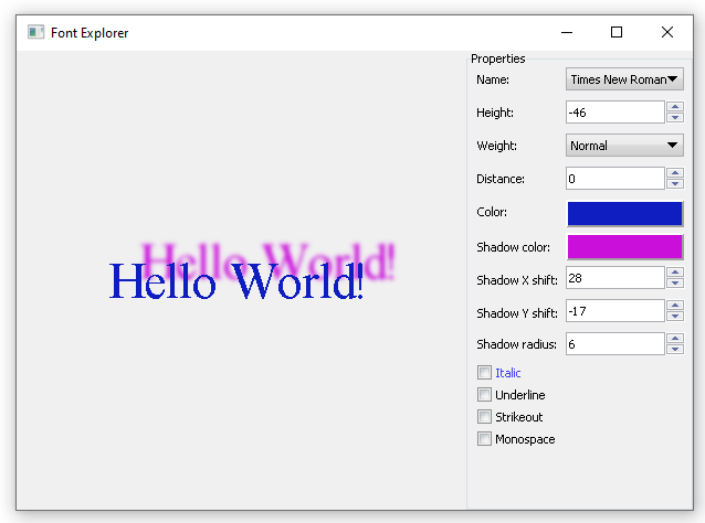
If you run application and change font properties at the right, you will see how text in the middle of the form changes.
The first thing you might have noticed is that for some different font weights the text looks the same. That is the limitation of some of the fonts themselves. The second thing you might have noticed is that changing any property related to shadow does not draw any shadow at all. The IRenderer draw text using information from IPlatformFont which describes font without any effects like shadows and coloring. To draw shadow we need to draw it ourselves. It is actually not so hard. All you need is to draw text into texture, blur texture and then draw it before drawing text.
We won't draw shadow ourselves, we will use helper function already added into framework for this. The function is located in the Nitisa/Render/Utils.h header file together with several more useful drawing functions. The function is called DrawTextShadow(). So, at first add include of that file in the beginning of the FormMain.cpp file. After it change drawing method to the following.
void CFormMain::FormMain_OnPaint(IForm *sender, const MessagePaint &m, bool &draw_children)
{
    if (!m.LastPass)
    {
        static const String text{ L"Hello World!" };
        IRenderer *renderer{ getRenderer() };
        IFont *font{ getFont() };
        IPlatformFont *pf{ getFont()->getPlatformFont(renderer) };
        PointF area_size{ m_pGroupBox1->getTransform()->getTx(), (float)getClientHeight() };
        PointF text_size{ pf->getStringSize(text, font->Distance) };
        PointF text_position{ (area_size - text_size) / 2 };

        RectF client{ text_position.X, text_position.Y, text_position.X + text_size.X, text_position.Y + text_size.Y };
        DrawTextShadow(renderer, pf, font->Distance, Identity, client + font->ShadowShift, text_position, text, font->ShadowColor, font->ShadowShift, font->ShadowRadius);

        Mat4f matrix{ ntl::Mat4Translate<float>(std::round(text_position.X), std::round(text_position.Y), 0) };
        CStorePrimitiveMatrix s_matrix{ renderer };
        renderer
            ->ActivatePrimitiveMatrix(&matrix)
            ->DrawText(text, pf, font->Distance, font->Color);
    }
}
As you can see we have only added two lines of code to draw text shadow. Most of the arguments of DrawTextShadow() function are clear. We only pay attention on two of them. The first one is matrix. This is a transformation applied to draw image with blurred text (shadow). We do not apply any additional transformation so we use Identity constant which defines matrix without any transformation. The second argument we want to focus on is client. It defines rectangle where shadow is to be drawn. It is just rectangle of the text with shadow shift. Text rectangle left top point is the text position and right bottom point is the text position plus text size. We calculate text rectangle and store it into client variable. Then we just shift that rectangle with the font shadow shift when we pass it to the DrawTextShadow() function.
Conclusion
As you can see font in Nitisa is described by its main interface IFont() but renderer can work only with IPlatformFont which has less properties. It has no shadow properties at all. So, when using fonts to draw something we need draw shadow separately if we want it to be drawn. Fortunately there is helper function to draw text shadow in one line of code.
Here you can see how working font explorer application looks like.
You can find project FontExplorer with lots of comments in the latest release of the Nitisa framework in Tutorials\FontExplorer folder of the Nitisa solution. To build it you have to select Debug configuration and x86 platform.