Creating a Control
In this article we show how to create your own controls and describe the most important things you should pay attention on. We will show step by step how to create a TreeView control. It's not a trivial control. Although such a control is already implemented in Standard Package we decided to show how it was built because it has all the parts which may be used togather with the control itself. We mean built-in controls and list items. The TreeView uses both of them.
Planning a control
Control states
Control behaviour
Built-in controls
Control & Service
Control declaration
Service declaration
List item owner
Implementation of the control
Implementation of the service
Implementation of the list item owner
Implementation of the scroll listener
The final code
Planning a control
At first we have to deside how the control should look like, which parts should it have, which states the control can be in. The TreeView control shows data in hierarchical representation. Thus it work with some items. There is a helper interface in the framework called IListItem. It allows to work with items in plain or hierarchical repersentation(or tree). Although it might be not nesseccary to use IListItem to represent the data, we will use it and all controls, which works with lists and trees, in Standard Package use this interface as well. There are several advantages of using it for data representation. It already has a commonly used logic implemented in CListItem implementation. It could be managed in Form Builder. There are several final list item implementations like CListItemLabel and CListItemColor.
After we have decided to use IListItem to represent a tree we now decide what visual parts should the control have. It will have borders, which have widths and colours. Between borders and content it will be a space called padding. A background will have two options. It can be either solid colour or filled with gradient. Our control also may have a shadow.
It would be nice to be able to set a height of the rows of the content. In the same time it would be nice if the control could display items in the height provided by item itself. It mean we have to add some setting indicating whether we should display all items with same height or take height from each item. Lets call this "ItemHeight". The one more thing regarding the items is that it would be nice to show and hide subitems. So lets display something like "+" or "-", depending on state, in square to provide ability to show and hide subitems in our tree. This element, lets call it "folder", will be customizable as well. It will have size and colours of "+" and "-", borders(width + radius + colour), background colour and gradient. It also will have additional lines when subitems are shown and settings for their width and color. Look at the following picture to see how it will look like when subitems are visible(at left) and hidden(at right).

What we need more is a scrollbars to allow user to scroll to invisible content if it doesn't fit in client area of the control. We will use existing built-in control implementation for it and don't need to worry about it properties. But we will add a properties related to it. It will indicate how vertical and horizontal scrollbars should appear. It will have 3 possible options: scrollbar is always visible, scrollbar is always hidden, and scrollbar is only visible when it is required.
Control states
Most of the controls can have different states. The initial state is called "normal state". What other states the TreeView can have? What about state when user move mouse pointer over the control? Lets call this state "hovered". Controls on the form can be focused. Only one control can be focused at the same moment of time and this control receives keyboard input. So, the TreeView can also be "focused". What about a combination of states? It can be focused and hovered at the same time. Lets call this state "FocusedHovered". And the final state we will add to our control is "disabled". In this state the control will not react on any user input. So, we have a set of states. The best way to describe sets is enumerations. Lets declare it and define all our states in it.
enum STATE
{
    stNormal,
    stHovered,
    stFocused,
    stFocusedHovered,
    stDisabled
};
Many properties, as you will see later, may have different values depending on current state. So, we declare them as arrays. For example, "BackgroundColor" will looks like this.
Color m_aBackgroundColor[stDisabled + 1];Control behaviour
The last part in planning the control is to decide it's behaviours. We want user be able to click on folder to show and hide subitems. We also want user could select and deselect items by clicking on them. We also want the control has option to allow or forbid multiple items selection at same time. Lets call this option "Multiselect". When scrollbars are visible we want they work in the usual way.
Built-in controls
When your control uses built-in controls, they should be prepared before. Usually the preparation is very simple. You just need to implement getControl method which should return your control. It means we need to declare a class for the scolls and implement it. You may do it in separate file but we preffer to make privite object inaccessible from outsite, so we declare it inside the private section of the control class., A declaration of the our scrollbar will be the following.
class CScroll :public CBuiltInScroll
{
private:
    CTreeView *m_pTreeView;
public:
    IControl *getControl() override;

    CScroll(CTreeView *treeview);
};
Often built-in controls use listeners to notify your control about changes inside the built-in control. So you must also implement corresponding listener. In our case it is IBuiltInScrollListener. It has 2 methods, one for informing about need to repaint the built-in control, the second is to inform about scroll. The listener we declare in the following way.
class CScrollListener :public virtual IBuiltInScrollListener
{
private:
    CTreeView *m_pTreeView;
public:
    void NotifyOnRepaint(IBuiltInControl *sender, const RectF &rect) override;
    void NotifyOnScroll(IBuiltInControl *sender) override;

    CScrollListener(CTreeView *treeview);
};
Control & Service
We have major helper parts declared now. The next is to create two classes. The first one is control itself, the second one is it's service. The control class should implement IControl interface. It is better not to implement it directly, but to derive your control class from CControl helper class which already has IControl methods implemented. If you are creating a component, you are going to use IComponent and CComponent instead. The same is for control service. It should implement IControlService interface and we are going to use CControlService helper class as base one. In the control class we will have getters and setters for the properties and some helper methods. We also will overwrite some methods of the CControl class. For example, the control render and client rectangles are different from default ones and should be adjusted.
There are two helper interfaces for the controls which use list items. You may to decide not to use them and it's okay. But we will in our example. Why? Because those interfaces are used in Form Builder. If you work with list items and you want your control items can be managed in the Form Builder, than you must derive your control from one of those interfaces. The first one, IComponentItemList, is for control(and components) with plain, 1 level, lists, like ListBox or DropDown. The second one, IComponentItemTree, is for controls whose items can have subitems(tree). So, the our TreeView control should implement the second interface.
Sometimes controls may provide their own events. Lets provide in our control following events.
- OnSelectItem stores user callback which is called when an item becomes selected.
- OnDeselectItem stores user callback which is called when an selected item becomes unselected.
As for control service, it is very easy. You have to overwrite only those methods and notifications(which are methods started with "Notify") which your control will process and do something in it. They could be separated into several groups: state change notifications, paint notifications, keyboard input, mouse input, and others. There is also one very important method called FreeResources. You must overwrite it if you use any window or renderer dependent resources. They are timers, textures, fonts. The CControl has font itself and it is responsible for it's releasing when required. You don't have to worry about it. But, if you declare your own font type properties, then you will manage them on your own.
We will draw our control into internal buffer, or texture. This is done for optimization. Most controls draw themselves in internal textures and then displays themselves on the form using that texture. Lets call this texture "canvas". So, we use a texture which is a renderer resource and we must overwrite FreeResources method to free it.
Control declaration
Here is a final control class declaration. The code has a lot of comments and we will add some notes after it to clarify some things.
#pragma once
#include "Nitisa/Interfaces/IComponentItemTree.h" // Helper interface we derive our control from
#include "Nitisa/Core/Control.h" // CControl helper class declaration
#include "Nitisa/Core/Gradient.h" // Gradient class declaration
#include "Nitisa/Core/ListItem.h" // Helper CListItem class declaration
#include "Nitisa/BuiltInControls/Scroll/BuiltInScroll.h" // Built-in scroll
namespace nitisa
{
// Forward declaraions
class CTreeViewService; // Service class
class CTreeViewListItemOwner; // List item owner class
class CTreeView :public virtual IComponentItemTree, public CControl
{
friend CTreeViewService;
friend CTreeViewListItemOwner;
private:
class CRootListItem :public CListItem // A root list item class to store entire tree of items
{
public:
IListItem *Clone() override;
CRootListItem();
};
class CScroll :public CBuiltInScroll // Built-in scroll
{
private:
CTreeView *m_pTreeView;
public:
IControl *getControl() override;
CScroll(CTreeView *treeview);
};
class CScrollListener :public virtual IBuiltInScrollListener // Built-in scroll listener
{
private:
CTreeView *m_pTreeView;
public:
void NotifyOnRepaint(IBuiltInControl *sender, const RectF &rect) override;
void NotifyOnScroll(IBuiltInControl *sender) override;
CScrollListener(CTreeView *treeview);
};
public:
// Some special constants for ItemHeight option
static const int ItemHeightAuto{ -1 }; // All items have individual height returned by getRequiredSize()
static const int ItemHeightText{ 0 }; // All items have the same height equal to line height of text "Wy"
// Control states
enum STATE
{
stNormal,
stHovered,
stFocused,
stFocusedHovered,
stDisabled
};
// Folder states
enum FOLDER_STATE
{
fsNormal, // Normal state
fsHovered // Hovered state
};
private:
using FItemCallback = void(*)(void *param, IListItem *item); // It is used to enumerate items in tree
// Elements of the control(used in detecting current element under the mouse pointer for example)
enum ELEMENT
{
elNone, // No element
elFolder, // Element is folder
elVScroll, // Element is vertical scrollbar
elHScroll, // Element is horizontal scroll bar
elItem // Element is one of the items in tree
};
// Store information about subitems visibility. Whether subitems are hidden(Folded = true) or visible(Folded = false)
struct ITEM
{
IListItem *Item; // Item which subitems folding state this object describes
bool Folded;
};
// Properties
RectF m_sBorderWidth; // Border widths
RectF m_sBorderRadius; // Radiuses of border corners
RectF m_sPadding; // Padding between borders and content
RectC m_aBorderColor[stDisabled + 1]; // Border colours depending on state
Color m_aBackgroundColor[stDisabled + 1]; // Background colour depending on state
Gradient m_aBackgroundGradient[stDisabled + 1]; // Background gradient depending on state
Color m_aShadowColor[stDisabled + 1]; // Shadow colour depending on state
PointF m_aShadowShift[stDisabled + 1]; // Shadow displacement of control depending on state
int m_aShadowRadius[stDisabled + 1]; // Shadow radius depending on state
Color m_aCornerColor[stDisabled + 1]; // When both scrollbars are visible there is a small rectangle at right bottom corner between them. It is its color
float m_fItemHeight; // Height of the items
// Folder
PointF m_sFolderSize; // Size
Color m_sFolderLinesColor; // Colour of additional lines of opened folder
RectF m_aFolderBorderWidth[fsHovered + 1]; // Square border widths depending on state
RectF m_aFolderBorderRadius[fsHovered + 1]; // Square corner radiuses depending on state
RectC m_aFolderBorderColor[fsHovered + 1]; // Square border colours depending on state
Color m_aFolderBackgroundColor[fsHovered + 1]; // Background colour depending on state
Gradient m_aFolderBackgroundGradient[fsHovered + 1]; // Background gradient depending on state
PointF m_aFolderSignSize[fsHovered + 1]; // Width and height of horizontal line in "-" and "+"(for vertical x and y are switched)
Color m_aFolderSignColor[fsHovered + 1]; // Colour of "+" and "-" depending on state
// Other properties
bool m_bMultiselect; // Whether multiple items can be selected at the same time
SCROLL_VISIBILITY m_eHScrollVisibility; // Horizontal scrollbar visibility type
SCROLL_VISIBILITY m_eVScrollVisibility; // Vertical scrollbar visibility type
float m_fScrollInterval; // Scroll timer interval when mouse is down
float m_fScrollDelta; // Scroll amount when scrolling when mouse is down and out of control rectangle
// Private data
ITexture *m_pCanvas; // Here we will draw the control
IControlService *m_pService; // The control service
IBuiltInScroll *m_pVScroll; // Vertical scrollbar
IBuiltInScroll *m_pHScroll; // Horizontal scrollbar
CRootListItem m_cRootItem; // Storage for the items. A root node
IListItemOwner *m_pListItemOwner; // List item owner
CScrollListener m_cScrollListener; // Scrollbars listener
bool m_bHScrollVisible; // Whether horizontal scrollbar is visible
bool m_bVScrollVisible; // Whether vertical scrollbar is visible
ELEMENT m_eHoveredElement; // Element under the mouse pointer
ELEMENT m_eDownElement; // Element which was under the mouse pointer when user down mouse button
IListItem *m_pHoveredItem; // Item under the mouse pointer
std::vector<ITEM> m_aItems; // Settings of folding for each items in tree
bool m_bItemsSorted; // Indicates whether previous list is sorted or not. We sort it for faster search
// Callback function for gradient to handle it changes
static void CallbackGradient(void *param);
IBuiltInScroll *getVScroll(); // Return vertical scrollbar. Create and setup if called first
IBuiltInScroll *getHScroll(); // Return horizontal scrollbar. Create and setup if called first
void Update(); // Updates the control after changes
bool UpdateHoveredElement(); // Find which element is under the mouse pointer now and handle change if it differs from previous one
bool UpdateHoveredElement(const PointF &position); // The same as previous but accept the mouse pointer coordinates
void UpdateHoveredItem(IListItem *parent, const PointF &position, PointF ¤t, ELEMENT &element, IListItem **hovered, const float line_height); // Find an item under the mouse pointer
void DeselectAllExceptFirst(); // Deselect all items in tree expect first selected item
void DeselectAllExceptFirst(IListItem *parent, bool &first); // Deselect all items in tree except first selected item. Recursive method
bool DeselectAllExceptItem(IListItem *parent, IListItem *exclude); // Deselect all items except specified one
bool DeselectAllExceptParent(IListItem *parent, IListItem *exclude); // Deselect all items except those whose parent is equal to "exclude"
bool DeselectAllExceptParent(IListItem *exclude); // The same as previous method but start search from root item
void DeactivateAllExceptItem(IListItem *parent, IListItem *exclude); // Deactivate all items except specified one
void EnumItems(IListItem *item, void *param, FItemCallback callback, void(*enumerator)(void *param, IListItem *item, FItemCallback callback)); // Enumerate tree
void SortItems(); // Sort item folding settings array
int FindItemIndex(IListItem *item); // Find index in item folding array of specified item
void CalculateRequiredSize(IListItem *parent, PointF &required_size, const float line_height, const int level); // Calculate required size of client area to fit entire tree in it's current state
void UpdateItemFromStyle(IListItem *parent); // Update item from style
void UpdateFromStyle(IStyle *style); // Update control from style
void Render(); // Render control
void RenderItems(IRenderer *renderer, const PointF &disp, const STATE state); // Render items
void RenderItems(IListItem *parent, IRenderer *renderer, PointF ¤t, const float line_height, const float client_height, ITexture **folder_normal_folded, ITexture **folder_hovered_folded, ITexture **folder_normal, ITexture **folder_hovered); // Render items
ITexture *RenderFolder(IRenderer *renderer, IListItem *item, ITexture **folder_normal_folded, ITexture **folder_hovered_folded, ITexture **folder_normal, ITexture **folder_hovered, const bool folded); // Render folder
void RenderScrolls(IRenderer *renderer, const PointF &disp); // Render scrollbars
void RenderCorner(IRenderer *renderer, const PointF &disp, const STATE state); // Render corner between scrollbars
bool ScrollToActiveItem(IListItem *parent, PointF ¤t, bool &changed); // Scroll to active item
IListItem *FindActiveItem(IListItem *parent); // Find active item
public:
void(*OnSelectItem)(IControl *sender, IListItem *item); // Event called when item becomes selected
void(*OnDeselectItem)(IControl *sender, IListItem *item); // Event called when selected item becomes unselected
IListItem *getRootItem() override; // Returns root list item
RectF getClientRect() override; // Overwrite to return correct client rectangle
RectF getRenderRect() override; // Overwrite to return correct render rectangle
IListItemOwner *QueryListItemOwner() override; // Return list item owner
CTreeView(); // Constructor
CTreeView(IForm *parent); // Constructor
CTreeView(IControl *parent); // Constructor
~CTreeView() override; // Destructor
IListItem *getActiveItem(); // Return active item
STATE getState(); // Return state of the control
bool isFolded(IListItem *item); // Return whether specified item is folded or not
// Property getters
RectF getBorderWidth() const;
RectF getBorderRadius() const;
RectF getPadding() const;
RectC getBorderColor(const STATE state) const;
Color getBackgroundColor(const STATE state) const;
Gradient *getBackgroundGradient(const STATE state);
Color getShadowColor(const STATE state) const;
PointF getShadowShift(const STATE state) const;
int getShadowRadius(const STATE state) const;
Color getCornerColor(const STATE state) const;
float getItemHeight() const;
PointF getFolderSize() const;
Color getFolderLinesColor() const;
RectF getFolderBorderWidth(const FOLDER_STATE state) const;
RectF getFolderBorderRadius(const FOLDER_STATE state) const;
RectC getFolderBorderColor(const FOLDER_STATE state) const;
Color getFolderBackgroundColor(const FOLDER_STATE state) const;
Gradient *getFolderBackgroundGradient(const FOLDER_STATE state);
PointF getFolderSignSize(const FOLDER_STATE state) const;
Color getFolderSignColor(const FOLDER_STATE state) const;
bool isMultiselect() const;
bool isMovable() const;
SCROLL_VISIBILITY getHScrollVisibility() const;
SCROLL_VISIBILITY getVScrollVisibility() const;
float getScrollInterval() const;
float getScrollDelta() const;
// Property setters
bool setBorderWidth(const RectF &value);
bool setBorderRadius(const RectF &value);
bool setPadding(const RectF &value);
bool setBorderColor(const STATE state, const RectC &value);
bool setLeftBorderColor(const STATE state, const Color &value);
bool setTopBorderColor(const STATE state, const Color &value);
bool setRightBorderColor(const STATE state, const Color &value);
bool setBottomBorderColor(const STATE state, const Color &value);
bool setBackgroundColor(const STATE state, const Color &value);
bool setShadowColor(const STATE state, const Color &value);
bool setShadowShift(const STATE state, const PointF &value);
bool setShadowRadius(const STATE state, const int value);
bool setCornerColor(const STATE state, const Color &value);
bool setItemHeight(const float value);
bool setFolderSize(const PointF &value);
bool setFolderLinesColor(const Color &value);
bool setFolderBorderWidth(const FOLDER_STATE state, const RectF &value);
bool setFolderBorderRadius(const FOLDER_STATE state, const RectF &value);
bool setFolderBorderColor(const FOLDER_STATE state, const RectC &value);
bool setFolderBackgroundColor(const FOLDER_STATE state, const Color &value);
bool setFolderSignSize(const FOLDER_STATE state, const PointF &value);
bool setFolderSignColor(const FOLDER_STATE state, const Color &value);
bool setMultiselect(const bool value);
bool setMovable(const bool value);
bool setHScrollVisibility(const SCROLL_VISIBILITY value);
bool setVScrollVisibility(const SCROLL_VISIBILITY value);
bool setScrollInterval(const float value);
bool setScrollDelta(const float value);
bool setFolded(IListItem *item, const bool value);
bool setBorderColor(const RectC &value);
bool setLeftBorderColor(const Color &value);
bool setTopBorderColor(const Color &value);
bool setRightBorderColor(const Color &value);
bool setBottomBorderColor(const Color &value);
bool setBackgroundColor(const Color &value);
bool setShadowColor(const Color &value);
bool setShadowShift(const PointF &value);
bool setShadowRadius(const int value);
bool setCornerColor(const Color &value);
void EnumSelectedItems(void *param, FItemCallback callback); // Enumerate selected items
bool ScrollToActiveItem(); // Scroll to active item
bool FoldAll(); // Hide all subitems
bool UnfoldAll(); // Show all subitems
bool Fold(IListItem *item); // Hide subitems of specified item
bool Unfold(IListItem *item); // Show subitems of specified item
};
}We need access private properties and methods of the control from external classes, that is why we declare them as friends. You will learn more about list item owner class later.
We have declared CRootListItem class because we can't use CListItem directly. It has pure virtual abstract method Clone which should be implemented. We use this class to store the root node of our items tree. It doesn't matter what exactly type the root item will have because it won't be displayed to end user and end user won't interact with it. That is why we derived it from CListItem helper class and didn't add any methods or properties to it.
There are several predefined types which are commonly used for properties.
- int is used for integer properties.
- float is used for floating point properties.
- bool is used for boolean properties.
- String is used for all string properties.
- PointF is used to specify positions and displacements line ShadowShift.
- RectF is used to specify rectangles, borders, and corners.
- Color is used to specify colours.
- RectC is used to specify border colours where each border can have own colour.
- Gradient is used to specify gradient.
User can access to the Gradient property and call it's methods to adjust gradient. To propery handle such changes we should provide to gradient a callback function which will be called by the gradient when any update occurs. That is why we need "CallbackGradient". And all callbacks should be either a common function or static method. Function pointers are incompatible with pointers to class methods.
The class has a lot of helper methods. They are usually different in different controls. But 2 of them you can find in almost all of the controls. They are UpdateFromStyle and Render. Both of them are called from the control service. You may also call them in different way or even don't use them at all. We use it in all our controls to make the code more common everywhere and recommend to do the same for you. The first method just set the control properties taking corresponding values from the style currently assigned to the control directly or through the parent. The second one renders the control.
We have 3 constructors here. It is common practice to have 3 constructors. User can create control without adding it to any parent, with adding it to form and to control as well. If your control doesn't support adding to form or to control, don't add the corresponding constructor. The first constructor, which has no parameters, is the main one. It does all the job of creating internal objects, setting initial values and so on. Constructors which add the control to form or another control usually just call the main constructor and then setForm() or setParent() to add to a form or to a control.
We have shown all required methods here but usually you will add required methods while implementing others. It is almost impossible to know at the beginning which methods you will need.
Service declaration
A control service class usually has less custom methods. It's main purpose is to implement notification handlers.
#pragma once
#include "Nitisa/Core/ControlService.h"
namespace nitisa
{
// Forward declaration of required classes
class IListItem;
class CTreeView;
class CTreeViewService :public CControlService
{
private:
CTreeView *m_pTreeView; // Pointer to the control
int m_hTimer; // Scroll timer identifier
static void CallbackTimer(void *param); // Timer callback
void CancelDown(const bool check_capture); // Abort job done on mouse down
PointF FormToHScroll(const PointF &pos); // Convert coordinates from form to horizontal scrollbar coordinate space
PointF FormToVScroll(const PointF &pos); // Convert coordinates from form to vertical scrollbar coordinate space
bool FindActiveItem(IListItem *parent, PointF ¤t, PointF &item_size, const float line_height); // Find active item
void ScrollToActiveItem(); // Scroll to active item
IListItem *FindActiveItem(IListItem *parent); // Find active item
bool ProcessKeyUp(); // Process keyboard up arrow down
bool ProcessKeyDown(); // Process keyboard down arrow down
bool ProcessKeyLeft(); // Process keyboard left arrow down
bool ProcessKeyRight(); // Process keyboard right arrow down
bool ProcessKeyHome(); // Process keyboard home key down
bool ProcessKeyEnd(); // Process keyboard end key down
public:
// Helpers
void FreeResources() override;
// State change notifications(from IComponent)
void NotifyOnAttach() override;
void NotifyOnDetaching() override;
// Notifications from parent control
void NotifyOnParentStyleChange() override;
void NotifyOnParentFontChange() override;
// State change notifications
void NotifyOnEnable() override;
void NotifyOnDisable() override;
void NotifyOnResize() override;
void NotifyOnStyleChange() override;
void NotifyOnFontChange() override;
void NotifyOnSetFocus(const MESSAGE_FOCUS &m) override;
void NotifyOnKillFocus() override;
void NotifyOnSetCaptureMouse() override;
void NotifyOnKillCaptureMouse() override;
// Paint notifications
void NotifyOnPaint(const MESSAGE_PAINT &m, bool &draw_children) override;
// Keyboard input notifications
void NotifyOnKeyDown(const MESSAGE_KEY &m, bool &processed) override;
// Mouse input notifications
void NotifyOnMouseHover(const MESSAGE_POSITION &m) override;
void NotifyOnMouseLeave() override;
void NotifyOnMouseMove(const MESSAGE_MOUSE &m, bool &processed) override;
void NotifyOnLeftMouseButtonDown(const MESSAGE_MOUSE &m, bool &processed) override;
void NotifyOnLeftMouseButtonUp(const MESSAGE_MOUSE &m, bool &processed) override;
void NotifyOnLeftMouseButtonDoubleClick(const MESSAGE_MOUSE &m, bool &processed) override;
void NotifyOnRightMouseButtonDown(const MESSAGE_MOUSE &m, bool &processed) override;
void NotifyOnRightMouseButtonUp(const MESSAGE_MOUSE &m, bool &processed) override;
void NotifyOnRightMouseButtonDoubleClick(const MESSAGE_MOUSE &m, bool &processed) override;
void NotifyOnMiddleMouseButtonDown(const MESSAGE_MOUSE &m, bool &processed) override;
void NotifyOnMiddleMouseButtonUp(const MESSAGE_MOUSE &m, bool &processed) override;
void NotifyOnMiddleMouseButtonDoubleClick(const MESSAGE_MOUSE &m, bool &processed) override;
void NotifyOnMouseVerticalWheel(const MESSAGE_MOUSE_WHEEL &m, bool &processed) override;
void NotifyOnMouseHorizontalWheel(const MESSAGE_MOUSE_WHEEL &m, bool &processed) override;
CTreeViewService(CCustomTreeView *treeview); // Constructor
};
}List item owner
When working with IListItem each item should be provided with interface called IListItemOwner. List items uses it to communicate with the control which owns the items. It is simple interface. Some list items may provide extended list item owner interfaces. List item owner has a helper class called CListItemOwner which implements some of the required methods of the IListItemOwner interface. You must at least implement the rest of them. They are usually the getters which should return a control, it's style, font and so on. And there are also a lot of notification methods which are called by the items at different actions. setOwner method is located in list item service.
m_cRootItem.QueryService()->setOwner(QueryListItemOwner());Implementation of the control
We won't write all the implementation here and sections about another classes implementation. We just describe the most important methods.
In constructor, at first, you should call a parent constructor: CControl(L"TreeView", true, true, false, true, false, true). The CControl constructor has following parameters.
- Class name is the name of your control class. The data type is String.
- Accept form indicates whether the control could be placed on a form directly. Boolean value.
- Accept control indicates whether the control could be placed onto another control. Boolean value.
- Accept controls indicates whether another controls could be placed onto the control. Boolean value.
- Accept focus indicates whether the control could be focused and receive keyboard input. Boolean value.
- Accept modal indicates whether the control could be modal. Boolean value.
- Tab stop indicates whether the control will be focused when moved between form controls by clicking Tab of Shift+Tab keys. Boolean value.
Then you set default values, callbacks and so on. It's the best place to set the default size of the control by calling setSize method. If you are configuring gradients in the constructor it is better not to call repaint and update each time. Instead add a variable member m_bIgnoreGradient of boolean type and set it to true before starting update and to false after finishing. And in the gradient callback just do update only if this flag variable if false. You also may set custom tranformation in the constructor if you don't like default one. Just use setTransform method. You don't have to worry about destruction of default transformtion. setTransform handles it automatically.
If you create custom objects which are not handled by CControl or couldn't be passed to CControl to handle them, you must destroy them by your own. It is usually done in the destructor.
When you overwrite methods like getClientRect and getRenderRect you just should return correct rectangles. If render rectangle is different for different control states, you may simple return the maximum rectangle. This will greatly simplify process of changing states and handling repainting.
In getters you just return corresponding variable value. It is common practice for gradient type properties to return not a gradient object but a pointer to it. As for setters, there are 2 common types of them. In both you first check if the argument is a correct value and if the property's value is different from the argument. Then, in case of first type of setter, you set the new value, call control update if required and repaint. The first type is used when setting property doesn't effect render rectangle and there is no other changes which may result in repainting. In the second type of the setter you locks repaint, call Repaint method to add current render rectangle to the repaint area(it is only required if the rendering area will be changed after setting new value for the property. For example, if you change ShadowShift), change values and call methods(if they cause in calling Repaint it is okay because the real painting will happen only once later when you unlock repainting), call Repaint, unlock repaint. There is a helper class called CLockRepaint. You may create a variable of this type(not a pointer!) instead of calling form's LockRepaint directly(don't forget to check if control is on a form before calling LockRepaint and UnlockRepaint directly). In this case you won't need unlock repaint at all bacause this will happen automatically when the CLockRepaint type variable will be destroyed.
When you are implementing the UpdateFromStyle don't forget about gradients. They will call your callback when changes from style happend. You don't have to repaint the control from UpdateFromStyle, it is done automatically, so just use m_bIgnoreGradient to prevent repainting like described before.
Control can have a lot of properties and it's good optimization idea to create objects only when they first requested because many of them couldn't be used by the end user. The best candidates for on demand objects creation in our control are scrollbars. So, we add 2 methods, getHScroll and getVScroll, which create if necessary an initialize scrollbars. These last two methods should be used everywhere to access scrollbars instead of direct access to the corresponding variables.
It is good optimization idea to draw control on internal texture, we call it canvas, and then just draw the texture. Usually controls has a lot of details in their layouts and drawing can take a while. In case your control has no lots of details which result in lots of drawing calls, you may omit using a canvas and draw control directly. For example if your control just draws solid background it would be faster to draw solid colour rectangle each time than creating a canvas, clearing it, filling it with the specified solid colour, and then drawing the canvas onto a form. So, when you use canvas, you first should check and draw control onto the canvas. Canvas is ITexture and has method called Invalidate. You may call it whenever you discover the current content of the canvas is not represent actual state. For example, when you just changed some property in the setter you have to invalidate canvas. You also have to check if canvas has been created and create it if not. If canvas already exists, check it's size as well cause it may be invalidated by size change. Well, when you discovered the canvas is invalid or has just been created/resized, draw the control on it and call it's method Validate. To check whether Invalidate was called just use isValid method of the canvas. If canvas is valid or has just been validated, draw it onto the form. There is usefull function in render helper to draw canvas. The function name is Canvas. You may call it in this way helpers::render::Canvas(renderer, matrix, m_pCanvas, disp);. It has four parameters. The first one is renderer, you may get it from the form getForm()->getRenderer(). Please note, when control isn't on a form, getForm() will return empty value. You usually don't have to worry about it because of the Render method is called from paint notification of the control service and notifiation is called by form when the real drawing is required. So, if control isn't on the form there is no form to call the paint notification and thus the Render methods won't be called. The second parameter is the transformation matrix of the control, you can get it by the control method getTransformMatrix. The third parameter is the canvas to be drawn. And the fourth parameter is the displacement of the control on the canvas. What does it meen? Do you remember what is the render rectangle? It is the entire rectangle of the control and it's effects. When a control has, for example, shadow, the shadow may be displaced around control in any directions. The render rectangle will include the control itself and the shadow and canvas should have the same size as the render rectangle. Assume the shadow is displaced to the left by 5 pixels and to the top by 8 pixels. The shadow on the canvas will start at 0, 0 point, while the control at coordinate about 5, 8. That is the required displacement. When shadow is moved to the right and to the bottom the displacement is 0, 0. There is a helper function to calculate the displacement when a control has shadow. It is in math helper and called DispOnCanvas. It has 3 arguments: shadow color, its displacement and blur radius. Here is how you call it PointF disp{ helpers::math::DispOnCanvas(m_aShadowColor[state], m_aShadowShift[state], m_aShadowRadius[state]) };. Where "state" variable is the current state of the control.
Implementation of the service
A service represents actions taken by the control in response for events. The implementation most of the notification methods are very simple. For example, in response to disabling control notification you just have to disable scrolls as well, remove hovered states of any hovered element if exists, and invalidate canvas if it exists. In response for the paint notification just call Render methods of the control after checking if it is the first pass or not(remember that drawings are happend in 2 stages). The most complicated notification implementations are usualy the keyboard and mouse ones. Their implementation is completely depends on the control logic and required behaviour.
Implementation of the list item owner
In list item owner you have to impement getters like getControl which is really easy, just return the control. You also have to implement notifications from the list item. If your control isn't interested in some of them, just left them empty. For example, NotifyOnEnable notification is called when list item becomes enabled. All you need to do is invalidate canvas and repaint the control. You may find more information in reference in IListItemOwner interface description.
Implementation of the scroll listener
This one is very small and clear as well. Just update and repaint control when required.
The final code
You may find it in Packages/Standard/Controls/TreeView folder. It is called there as CustomTreeView. That is bacause it is used as a base for several other controls very similar to this one but accepting only specific type of items. You are welcome to observe a source code of the controls in Standard package to see how things should be done. You also may be interested in reference of the base interfaces like IControl, IControlService. Look at them to better understand the logic of the control methods implementation.
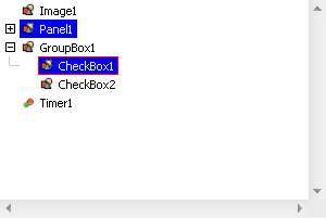
You can see the control derived from CustomTreeView even in the Form Builder. It is an Hierarchy Editor part.