StackedBarChart
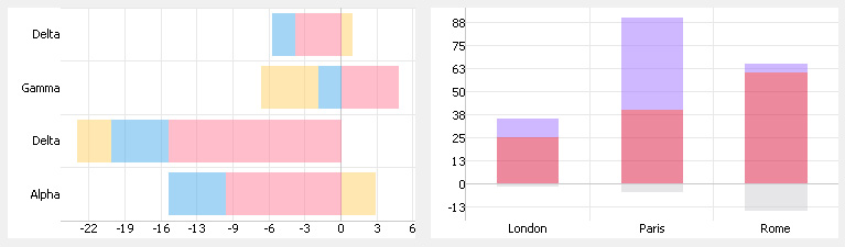
StackedBarChart widget looks like on the picture below. It can be used to draw data sets as bars splitted into zones representing amount of each corresponding point in data sets relatively to its total amount. It is very usefull in comparison of data.
This widget doesn't use custom renderer assigned to data set. Thus custom drawing is not supported.
X-coordinate of data points is used in vertical mode only. Y-coordinate of data points is used in horizontal mode only.