Form Builder
Form Builder allows to create form layout visually by using drag and drop. It generates a form class as well. After reading this article you will know everything about it's usage and powerful features.
General
Actions bar
Layout
Controls and components
Configuration
Settings
Form Editor
Hierarchy editor
Property editor
Event editor
All the following explanations describe standalone Form Builder. If you are using Nitisa extension and integrated into Visual Studio form of Form Builder, every explanation remain the same except for New, Open, Save, and Save as buttons. In the integrated version they all are disabled and you have to use standard Visual Studio's ones instead.
General
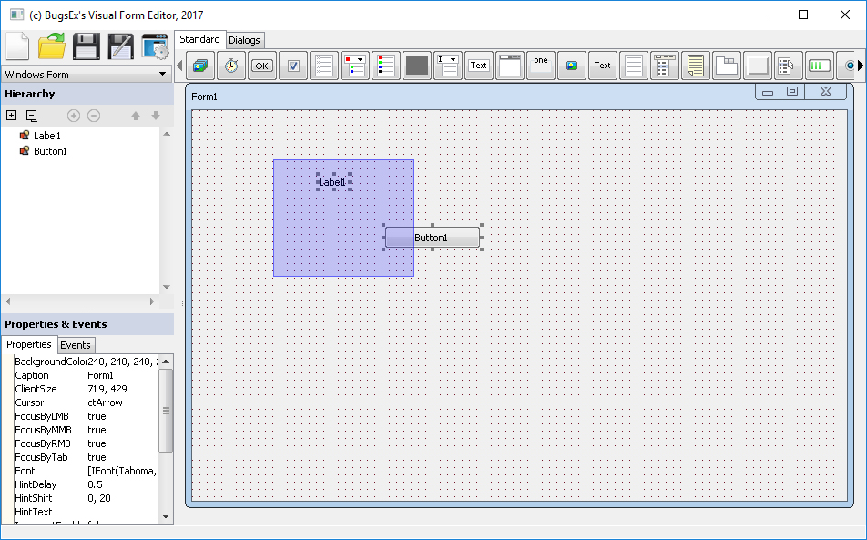
Look at the Form Builder. Its window consits of several parts
- Actions bar. It allows to create new forms, save your work, open saved forms and access configuration.
- Layouts switcher allow to change form layout.
- Controls and components(or simply widgets) section contains all available controls and components from installed packages.
- Hierarchy editor contains a hierarchical representation of your form layout. It also allows editing and reordering controls.
- Property and event editors section contains two similar tools. Property editor allows you to edit properties of all objects and event editor allows to edit their events.
- Form editor is the section where you edit layout of your form.
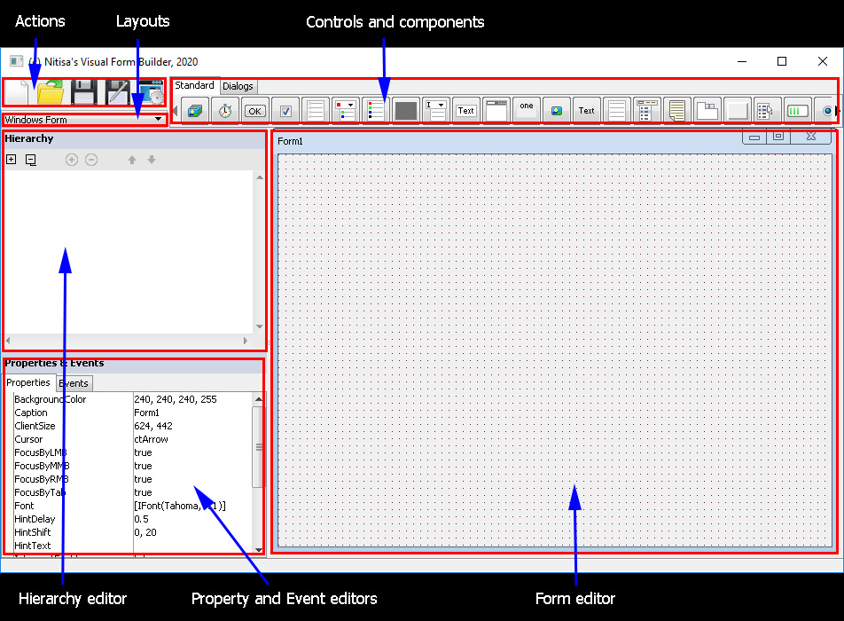
Between form editor and left section containing hierarchy, property, and event editors there is a splitter. You can drag it to change an area occupied by form editor part and left section. The similar splitter is between hierarchy editor and property/event editors. Lets now talk about all it's parts and learn how they can be used.
Actions bar
Actions bar has 5 buttons for different actions. They are(from left to right) New, Open, Save, Save as, Configure.
- New button creates a new empty form. If you already have form changed you will be asked if you want to save changes before creating a new form.
- Open button shows you a file selection dialog which you can use to observe file system and find a form you want to open in Form Builder. If you already have form changed you will be asked if you want to save changes before opening a new form.
- Save button saves your form into a file and also generates a form prototype header file. If you didn't save file before it will ask you for where do you want to save a form and it's file name. We recommend to save it in the same name as you gave to your form.
- Save as button works in the similar way as Save but it always ask a file name where to save a form.
- Configure button opens the Form Builder configuration window. You may read about this window later in this article.

In the Form Builder integrated into Visual Studio only the last button(configuration) is available. Create new forms, open and save them in the standard way you create, open, and save any files in the Visual Studio.
Layout
Layouts switcher is a simple dropdown. All available layouts are listed in it. By selecting an item in this dropdown you will change the appearance of the form. One of the layouts is shown on picture below. Be careful when switching layout. The form size may be changed.
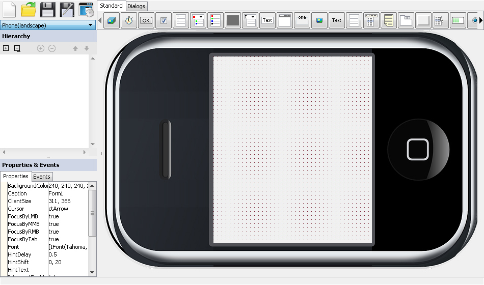
By default several layouts exist. They represent form like a usual Windows OS window, phone(both portrait and landscape), and tablet(same has both portrait and landscape types). You also may create your own layouts. Form Builder load layout configurations from specific location. It should be a folder called FormLayouts in the same folder where Form Builder excutables are located itself or one or two levels above it. In this folder you may create subfolder for your layouts. By default there is a folder called Standard. The creation of a layout is quite simple. All you need is images for form borders representation and a configuration json file.
At first lets talk about form layout images. Each form has 4 borders: left, top, right, bottom. You must create images for these borders. At least for those of them which you want to be drawn in the Form Builder. A border images can have following parts.
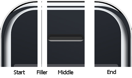
- Start part. It represents a left part of the top border shown on the picture above. It is shown without any transformation in Form Builder.
- Filler part. This part is shown by duplication itself in X or Y direction depending on the border. If there is a middle part the filler is shown before and after it. If no middle part exists the filler is shown between start and end parts or after start if there is no end one, or before end if there is no start part, or on entire border if there is no other parts.
- Middle part is shown in the middle of the border and isn't transformed.
- End part is shown at the end of the border. In this example the end part is the most right one.
Each border can have all or just some of this parts. When border has an untransformable parts like start, end, and middle ones, the minimum form size is calculated using this images sizes. You also can use the same images in different borders if they are same. Left border images are turned counterclockwise by 90o before drawing. The right border images are turned the same amount but in clockwise direction. Please pay attention on this when creating your own images for borders. All images should be placed in the folder you have created for your layout.
When you have your layout border images you have to create a layout configuration file. It should be placed in the same folder. You may give it any name with json extension. File format is json in UTF-8 encoding. It may have following properties.
- title - a string with layout title displayed in layouts dropdown of Form Builder. This property is required.
- landscape - a boolean value indicating whether layout is portrait or landscape one. Assumed false if this property is missing.
-
size - an object specifying default form size. The size of the form isn't changed when activating this layout if this property is missing. It has following properties
- width - default form width
- height - default form height
-
caption - information about where and how display a form caption on the layout. If missing assumed a caption shouldn't be displayed. It has following properties
- padding - array of 4 integers indicating caption padding onto the border. It has left, top, right, and bottom values.
- border - a string indicating on which border a caption should be drawn. It may be
left,top,right, orbottom.
-
left - an object with information about left border images. If missing, left border won't be shown. It has following properties
- start - file name of the border start image. Optional.
- middle - file name of the border middle image. Optional.
- end - file name of the border end image. Optional.
- fill - file name of the border filler image. Optional.
- top - an object with information about top border images. If missing, top border won't be shown. Has the same properties as left border has.
- right - an object with information about right border images. If missing, right border won't be shown. Has the same properties as left border has.
- bottom - an object with information about bottom border images. If missing, bottom border won't be shown. Has the same properties as left border has.
Here is an example of the layout configuration file.
{
    "title": "Phone",
    "landscape" : false,
    "left": {
        "fill": "phone-leftright-fill.png"
    },
    "top": {
        "start": "phone-top-start.png",
        "middle": "phone-top-middle.png",
        "end": "phone-top-end.png",
        "fill": "phone-top-fill.png"
    },
    "right": {
        "fill": "phone-leftright-fill.png"
    },
    "bottom": {
        "start": "phone-bottom-start.png",
        "middle": "phone-bottom-middle.png",
        "end": "phone-bottom-end.png",
        "fill": "phone-bottom-fill.png"
    },
    "size": {
        "width": "670",
        "height": "1280"
    },
    "caption": {
        "border": "top",
        "padding": [8, 0, 0, 0]
    }
}
Controls and components
This section contains all controls and components(also called widgets) available to add to your form. It may have several tabs with them. To add control to a form just click on the button of required control or component in this section on any tab and then click on the form where you want to add specified control/component. If you clicked on wrong control just click on correct one and then add it to form. If you move mouse over buttons of this section and wait a couple of seconds you will see a hint with name(and probably another information about the control, it depends on the control itself) of the control. When there is no enough space for all the controls on any tab, like you can see on the picture below, a scrolling possibility will appear. You may scroll by click and hold on left or right arrow at left or right part of the tab or by scrolling mouse wheel.

Configuration
You may open Form Builder configuration form by corresponding button on actions bar. At this form you may change Form Builder settings related to form grid, selection, and generation of the form prototype header file. After editing you can click on one of the Apply buttons or press Ctrl+Return key combination to apply changes globally or click on Cancel button or press the Escape key to cancel changes. The configuration form looks like on the picture below.
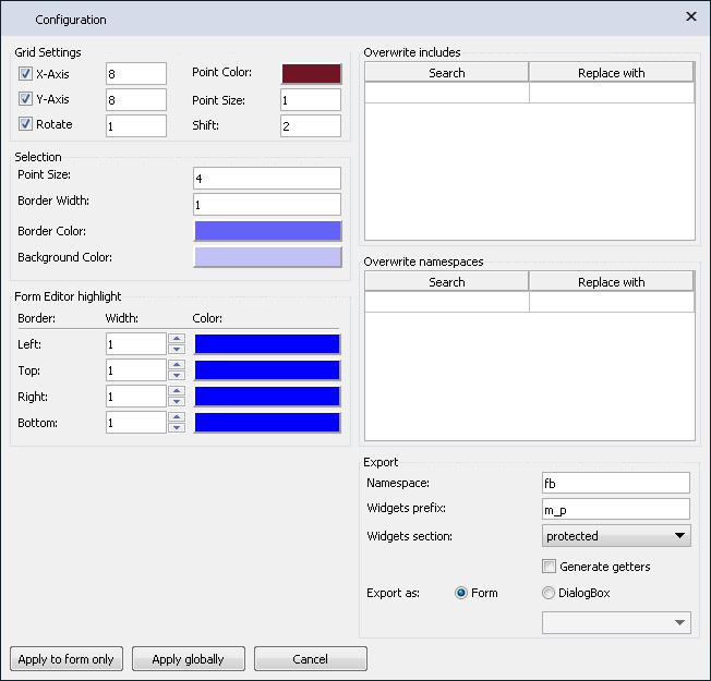
And here is a list with description of each option.
-
Grid Settings section describes form grid settings
- X-Axis checkbox indicates whether a movement and sizing of controls should be sticked to form grid in X direction.
- Y-Axis checkbox indicates whether a movement and sizing of controls should be sticked to form grid in Y direction.
- Rotate checkbox indicates whether a rotation of controls should be sticked to rotation grid.
- X-Axis input stores a grid step in X direction.
- Y-Axis input stores a grid step in Y direction.
- Rotate input stores a rotation grid step in degrees.
- Point Color stores a color of grid points on a form.
- Point Size stores a point size of a grid shown on a form.
- Shift stores a rotation helper marker shift in X direction of selected control.
-
Selection section describes selection interface layout
- Point Size - size of the transformation helper markers of the selected control.
- Border Width indicates a border width of the box displayed when selection by drag and drop takes place.
- Border Color indicates a border color of the box displayed when selection by drag and drop takes place.
- Background Color indicates a background color of the box displayed when selection by drag and drop takes place.
-
Form Editor highlight section holds information about highlighting Form Editor when it is active
- Left - left border width and color of Form Editor when it is focused.
- Top - top border width and color of Form Editor when it is focused.
- Right - right border width and color of Form Editor when it is focused.
- Bottom - bottom border width and color of Form Editor when it is focused.
- *Note: you may set all border width to zero if you don't want highlight at all.
-
Overwrite includes and Overwrite namespaces sections allow to change a little form prototype file being generated by Form Builder for your forms. First one allows to change beggining of widget include files and second one allows to change namespace prefixes for widgets and their parameters.
When it may be useful? Lets say you create your own widgets in a package called SuperWidgets. In this case if you follow framework structure, you package will be in the folder called SuperWidgets and all the code(include all widgets) will be inside namespace called
superwidgets. If you have forms in your package you doubtless will use Form Builder to create them. Suppose you place one or more widgets from your package on such a form. In this case Form Builder will generate form prototype in standard way adding#include's as you specify them in your package entities and in the same way prefixing widgets with corresponding namespace. Lets say you have in you package a widget called SuperGrid. This widget is described in standard way and the code generated for it will be somethis like following.... #include "SuperWidgets/Controls/SuperGrid/SuperGrid.h ... namespace nitisa { ... m_pSuperGrid1 = new superwidgets::CSuperGrid(); ... }It is not right because your form is also included into your package. To make Form Builder generate form prototype correctly you may use overwrite features. So, in this case just add overwrite of SuperWidgets for ../..(supposing you form is placed inside folder SuperWidgets/Forms/[Name]/) header and overwrire superwidgets namespace with empty string. If you do so the Form Builder will generate following instead of previous one.
... #include "../../Controls/SuperGrid/SuperGrid.h ... namespace nitisa { ... m_pSuperGrid1 = new CSuperGrid(); ... } -
Export section contains options for generation form prototype
- Namespace - a namespace where the form prototype class should be placed.
- Widgets prefix - a prefix for all controls and components which will be added to their names in form prototype class.
- Widgets section - indicates where to put widgets in the form prototype class.
- Generate getter checkbox allow to turn off and on generation methods in public section of form prototype class which returns pointers to widgets. The methods will be called get+[Widget name]. For example, if you have button widget from Standard package called ButtonOk on your form, the method generated in public section will be
standard::CButton *getButtonOk(); - Export as - indicates how form prototype will be generated. It can be either regular standalone form or dialog box. When selecting DialogBox option you also have to chose which dialog box should be used as base class. Depending on this option generated form prototype header file will contain code either for regular form or for dialog box. It may be that you want prototype header file and form name will be different depending on the option you select and it must be prefixed either with Form or with DialogBox but you do not want to have two form files for that. For such a case you can use {type} placeholder for form's Name property. For example, if you set your application main form's Name property to {type}Main and then save it with this option set to Form, the Form Builder will create form prototype header file with name IFormMain.h with form prototype class inside called
IFormMain. If you now switch this option to DialogBox and select from which dialog box to derive yours and save the form again, you will get file called DialogBoxMain.h with dialog box class prototype inside calledIDialogBoxMain.
You may change colors by clicking on corresponding panels. A color selection dialog will appear.
Apply to form only button will close configuration window and apply settings to your form only. It means when you close Form Builder and then open it again, old settings will be applyed but each time when you load this particular form new settings will be loaded from its *.nfr file and applyed in Form Builder.
Apply globally button will close configuration window and apply settings globally also removing settings from your form if there is ones. You also may press Ctrl+Enter key combination.
Cancel button will close configuration window and cancel all made changes. You also may press Esc button.
Settings
Some settings are currently not presented in configuration window of the Form Builder. They are related to packages and controls and could be changed by editing a special configuration file called packages.json which should be placed into the same folder where the Form Builder executables are. By default there is no such file and default settings are used. It means all available packages will be loaded and all entities will be enabled. If you want to disable some widgets of entire packages you have to create the packages.json file with the following format. It should be in UTF-8 encoding. Following properties could be put inside.
-
packages - an array with settings for all installed packages. Each of the entry have following structure
- filename - a string with name of the package dll file. The package file has Package.*.dll naming format. Where * is the package name. Should be the in the same case as corresponding compiled package file.
- hidden - an optional boolean value indicating whether the package is complitely hidden or not.
- components - an array of component names which shouldn't be available in Form Builder.
- controls - an array of control names which shouldn't be available in Form Builder.
- forms - an array of form names which shouldn't be available in Form Builder. For future use.
- renderers - an array of renderer names which shouldn't be available in Form Builder. For future use.
- styles - an array of style names which shouldn't be available in Form Builder.
- handlers - an array of property handler names which shouldn't be available in Form Builder.
Here is an example of the configuration file. Two controls from the Standard package named Container and ValueListEditor are hidden in the Form Builder.
{
    "packages": [
        {
            "filename": "Package.Standard.dll",
            "hidden" : false,
            "controls": ["Container", "ValueListEditor"]
        }
    ]
}
Form editor
A form editor is a part of the Form Builder where you design a layout of a form for your application. To place a control onto it just select required control at controls and components section by clicking on control's button and then click on the form editor. To select control in form editor just click on it. To select multiple controls click on all controls you need by holding a Shift key on the keyboard. If you click second time on a selected control with down Shift key the control will be deselected. To select all controls and component on the form just click Ctrl+A key combination. You can also select by down left mouse button somewhere on the form and drag it while left mouse button is down. Then release the button.
To delete selected controls and component you may press Delete key on your keyboard. Please note, the keyboard keys and combinations work only when form editor is active. It becomes inactive when you click on another parts, like control button or property editor, of the Form Builder. To activate form editor you must click on it(by left or right mouse button; in case of right one the selection will remain unchanged). When multiple controls are selected only movement is remain available. You may see it by changed color of transformation markers. Also, components couldn't be neither resized no rotated. By default all operations like movement, resizing and rotation are sticked to the grid. You may disable a grid in Form Builder configuration. You may move selected controls and component by arrows on your keyboard. If you hold a Shift key, you will resize it instead of moving. Operation with arrows are not sticked to the current grid but if you want it, you may also hold Ctrl key.
If currently selected layout allows to resize a form you may do it by dragging form's right or bottom border or it's right-bottom corner.
When form editor is being in focus it is hightlighed by blue border as shown on image below. You can change highlight color and border width in the Form Builder settings. It is also possible to disable such highlight at all by setting border widths to zero. This highlight goal is to improve user experience when working with Form Builder. Some key combinations work only when Form Editor is focused and some have different actions depending on what part of the Form Builder is focused(activated). So you can see now when Form Editor is focused and you will knew exact behaviour of key combinations before trying them.
Hierarchy editor
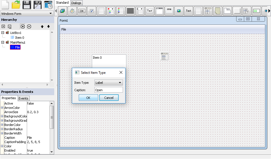
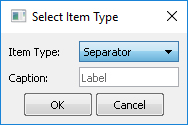
Hierarchy editor represents your form hierarchically and allows you to do some things you can't do with form editor. When you select or deselect controls in form editor, they become selected or unselected in hierarchy editor as well and vise versa. To select control in hierarchy editor just click on it. To add or remove control from selection hold Ctrl key and click on it. Although several controls can be selected, only one can be active. It's highlighted by red border if control is selected as well or with black border when it is active but not selected. Some actions applied only to active control. You also may use arrow keys and Home and End to select and activate first, last, previous, next control and to move inside or outside in hierarchy. You can toggle hierarchy subitems visibility by buttons looking like "+" and "-" in square. Buttons with up and down arrows allow to adjust active control creation order. If you press a Delete key, all selected controls, components and other objects will be deleted. The same happens when you click on button looking like circle with "-" inside. Some controls and components allow to add child controls or items. If active control/component/item allow to do it, then you may click on button looking like circle with "+" inside and add child control or item. Some controls allow to add items to first level only(for example, ListBox). So, even if you click on one of it's items and click add button, the new item will be added to ListBox itself, not to active item. Some other controls may have many levels or items. We call it tree. For such controls, a new item will be added as subitem of active item. Some controls, like MainMenu shown on picture below, asks you a type of item you want to add and some additional data before adding item.
The one of the most important actions you can do only with hierarchy editor is moving controls onto or out of other controls. To do that just drag and drop selected controls onto a control you want them to be moved to. If the operation is not possible you will be informed by changed mouse pointer. To move control from another control directly onto a form, drag and drop it onto a free space of the hierarchy editor. You can also select items which isn't possible in form editor. When you select item you can edit it's properties in property editor. Controls, components, and items have different icons in hierarchy editor. You may read more about different kinds of objects in Concepts article.
Property editor
This editor allows you to edit properties of controls, components, items, and form. When nothing is selected the property editor contains properties of a form. When you select something on a form or in hierarchy editor, the property editor contains it's properties. When multiple objects are selected you still may edit theirs common properties. Please note, in this case the first selected object properties are displayed but when you edit any property the change applies to all selected objects. You can use keyboard arrows and common keys like Home, PageDown etc. to navigate among properties. Some properties, as you can see, has multiple "suboptions". You can access them by clicking on "+" icon at the left of property name. Thise "suboptions" indicates that property has different value depending on control state and you may set this values separately for every allowed state. When you click on property(the same occurs when you use keyboard to move to other property in the list) it becomes active and you can edit it's value. Some properties could be edited directly inside property editor, the other onces can only be edited in external window. Usualy there will be a little button with 3 dots at the active property right indicating it has external editor window and you may click on it(or double click on property value) to open the editor window. There are a lot of different kind of extenral editors. Their layout and behaviour depends on property and provided by installed packages.
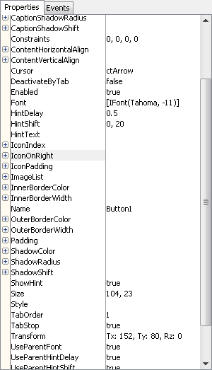
By dragging a thin line between property names and it's values you may change area occupied by properties names and values. When you double click on it the area will be splitted equally.
Most external editors are simple and clear. However, to have a complete documentation, we are going to write a little about each external editor provided by Standard Package. Although this information is related to Standard Package it is placed here instead of Standard Package reference.
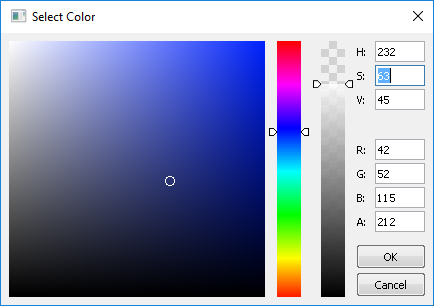
Color
This editor allows you to select a color. You may click on colored sections to select a color visually. The left one is called HSV plane and the other one is HSV bar. You also may specify exact values either in HSV or RGB formats. Don't forget to specify a correct "A" value which is transparence or alpha channel. 0 - completely transparent, 255 - completely opaque. You may use Enter and Esc keyboard keys to apply and cancel changes.
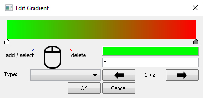
Gradient
This editor allow you to design gradients visually. You may add control points to gradient by clicking on it's visual representation at the top part of the editor's form and remove by clicking right mouse button on the point you wish to remove. You may click on point to make it selected and drag it to change it's position visually. You also may set position to precise value in input. The value should be in range 0..1. For the selected point you can change color by clicking panel at the left below the gradient. The already known color editor will appear. By buttons with arrows you may switch between gradient points. It may be useful when they are too close to each other and it is impossible to do by clicking on point. Also you may select a gradient type from dropdown. The appearance of gradient will not change in the editor but don't worry it will be applied to the property you edit. You may also apply changes by pressing Ctrl+Enter and cancel by Esc key.
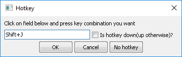
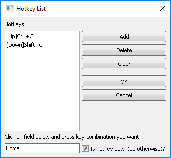
Hotkey
It is used to specify a hotkey combination. Just activate input and press any key combination you want. Specify whether it is key down or key up combination(some properties work well regardless of this flag) by using checkbox at the right. If you don't want any hotkey use No hotkey button to clear the input.
Hotkey list
This editor is similar to previous one but it manages a list of hotkeys. You may add and delete hotkeys, clear the list and then click OK to apply changes or Cancel to cancel them.
Image
This editor allows you to load and remove image in property. After image has been loaded you will see it's size below buttons. Avoid having properties with large images. It's better to have them separately from application and load manually. Images in properties are stored without any compression and even more they have a lot of source code produced while generating form prototypes.
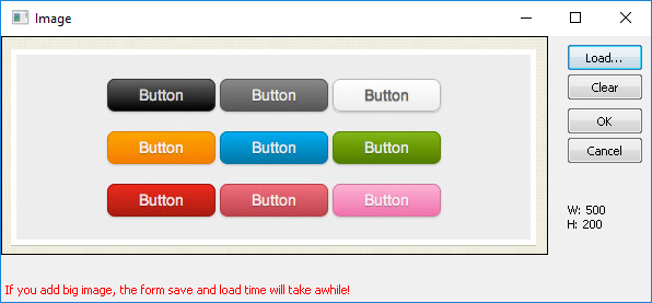
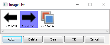
Image list
This editor allows you to edit properties which stores several images at once. We call it image list. In images view you may click to select image and delete it if you have added it accidentally. The same caution: avoid using big images and a lot of small ones as well.
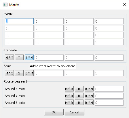
Matrix
This editor allows to specify matrices directly by editing their cells. The framework uses 4x4 matrices to transform vectors. When transforming a vector it is multiplied by matrix(vector * matrix). Remember this when writing matrix cells.
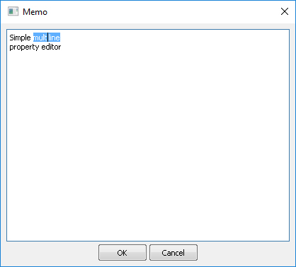
Memo
This editor is a simple multiline text editor. It has a common for all text editors functionality and hotkeys.
Menu list item
This editor is specific. It designed for Standard Package menus only. It allows you to select what kind of item to add to MainMenu or PopupMenu controls.
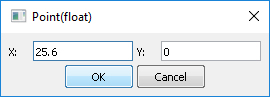
Point/PointL/PointF/PointD
Thease four similar editors allow you to edit properties which stores 2 values either integer or float types. Many properties has such a type values. For example, ShadowShift which indicates how far shadow should be placed relative to the control in X and Y directions.
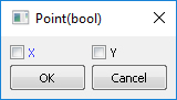
PointB
This editor allows to edit properties which store 2 boolean values.
Rect/RectL/RectF/RectD
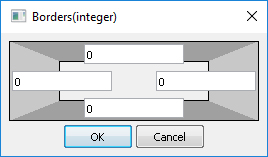
These editors allow you to specify a property value which consists of 4 values either in integer or in float form. For example, BorderWidth property usualy stores information about width of all four borders.
RectB
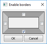
This editor allows to edit properties which store 4 boolean values.
RectC
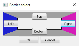
This editor is used to edit 4-component properties of color types. For example, BorderColor property specifies a color of each of 4 possible borders.
Transform
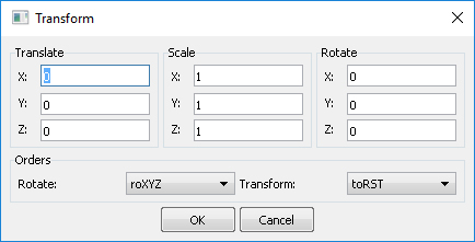
This editor allows to edit transformations. Transformation object is widely used. All controls have a transformation. Transformation consists of three types of transforms: translation or moving, rotation, and scaling. You may specify these values in inputs. Rotation values should be in radians. Also it has an information about how all this transforms should be applied togather. You may specify the order or rotation and the order of transforms. It is recommended to use default orders.
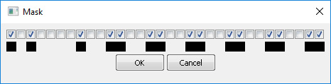
Mask
This editor allows you to edit binary masks visually. Binary mask is a 32-bit unsigned integer value each bit of which is used as mask. It bit value is zero then there will be no drawing at the point corresponding to the bit position. Drawing using binary masks are usually can be found in controls with "outline" properties. For example, StringGrid uses it to outline active cell.
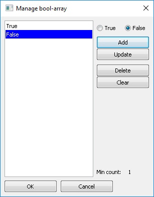
BoolArray
This editor goal is to allow management of properties which are arrays of boolean values.
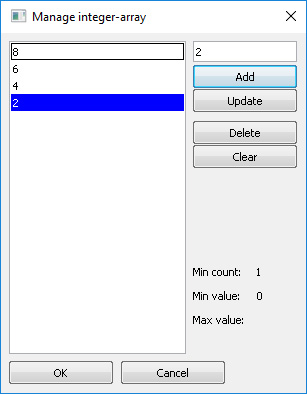
IntegerArray
This editor goal is to allow management of properties which are arrays of integer values.
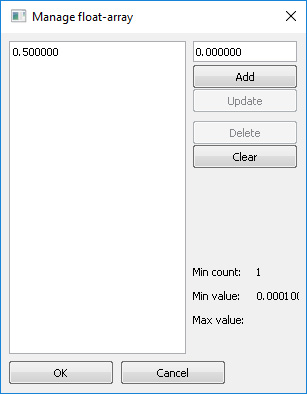
FloatArray
This editor goal is to allow management of properties which are arrays of floating point values.
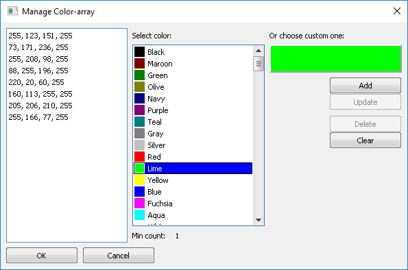
ColorArray
This editor goal is to allow management of properties which are arrays of color values.
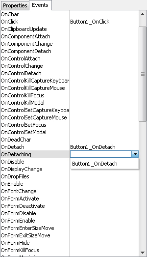
Event editor
Event editor allow you to edit names for controls' events. These names will be put into a form prototype header file as class methods and should be implemented by you in your application. If you don't want event just clear value near it's name. When event value is empty you may double click on it and event editor will generate a name for it based on the control and event names. You also may use drop down to assign already existing event. Only compatible events will be in list. Note: if you assign same event value/name to different events, the same method will be called for different events and you should probably recognize them somehow in your C++ code to take proper action.